
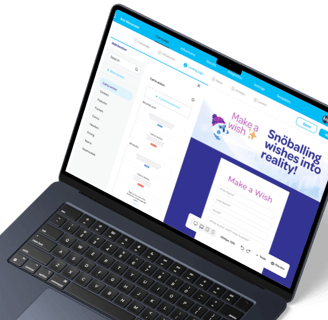
Marketing Dashboard
Redesign

I was tasked with improving Snöball’s event marketing dashboard usability to make campaign creation more seamless, along with enhancing navigation and performance tracking.
UX Research,
UI Dashboard design
Usability Testing
Prototype
Figma
Miro
Fathom
Slack, AdobeXD
MY ROLE
TOOLS
campaign manager,
Product manager,
Developer
TEAM
PROJECT OVERVIEW
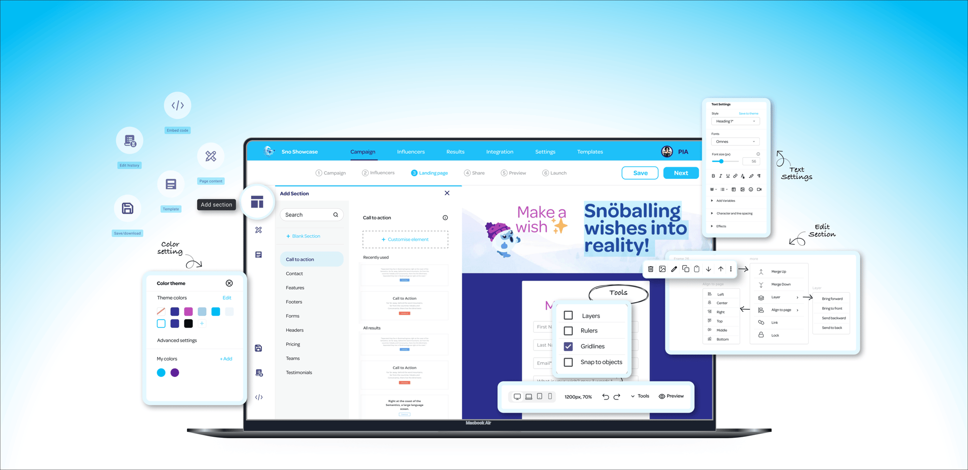
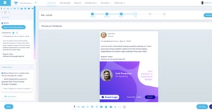
I identified usability issues affecting discoverability, engagement, and workflow efficiency. The dashboard had unclear navigation, making it difficult for users to access key features. The landing page lacked essential elements and a clear flow. Users struggled to find elements within the editor, limiting efficiency. The sharing page lacked a preview option, making it difficult to review content before posting, and users faced challenges in checking how posts appeared across different social platforms.
Problem
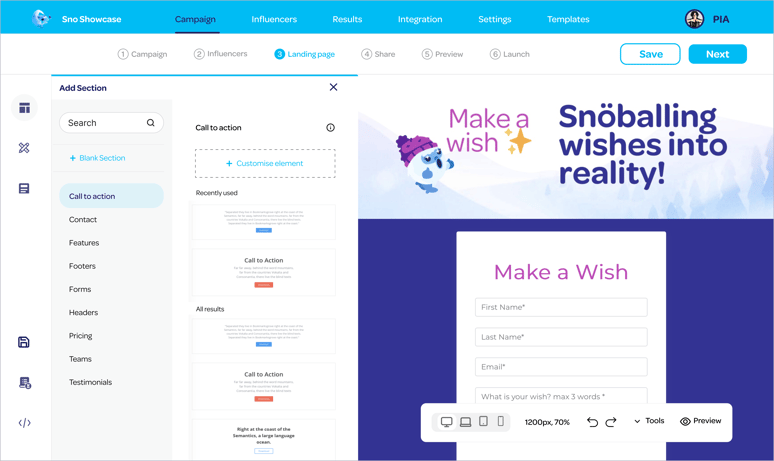
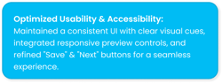
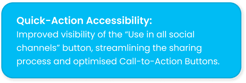
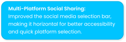
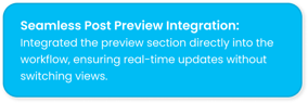
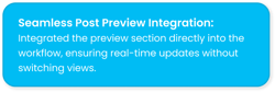
To enhance the landing page’s usability, I restructured the layout by clearly separating sections for better navigation and flow. Added a template-saving option in the editor for efficiency. Introduced a live preview on the sharing page, removing repetitive save-and-preview steps and making social media sharing seamless.
Solution

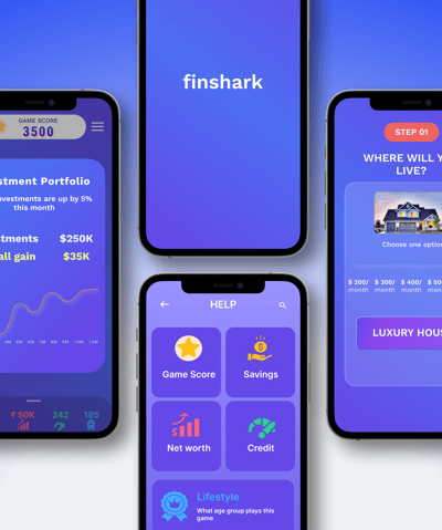
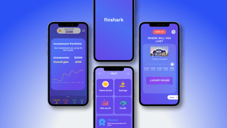
Marketing Dashboard
SNÖBALL DASHBOARD REDESIGN
Redesign Snöball’s dashboard to improve usability, streamline navigation, and simplify key workflows, enabling users to create and manage campaigns more efficiently. This would help businesses execute campaigns seamlessly and scale their marketing efforts more effectively.
THE DESIGN CHALLENGE 🎯


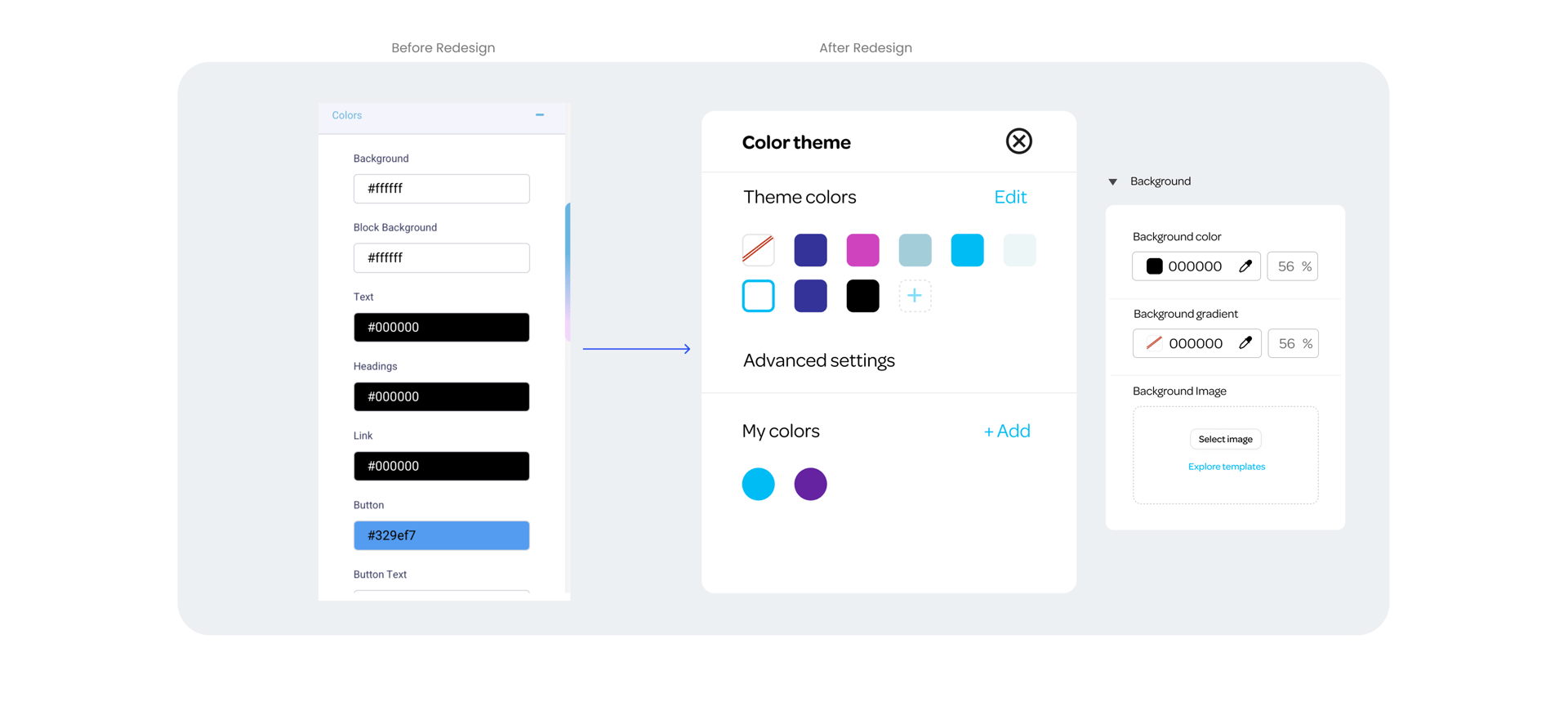
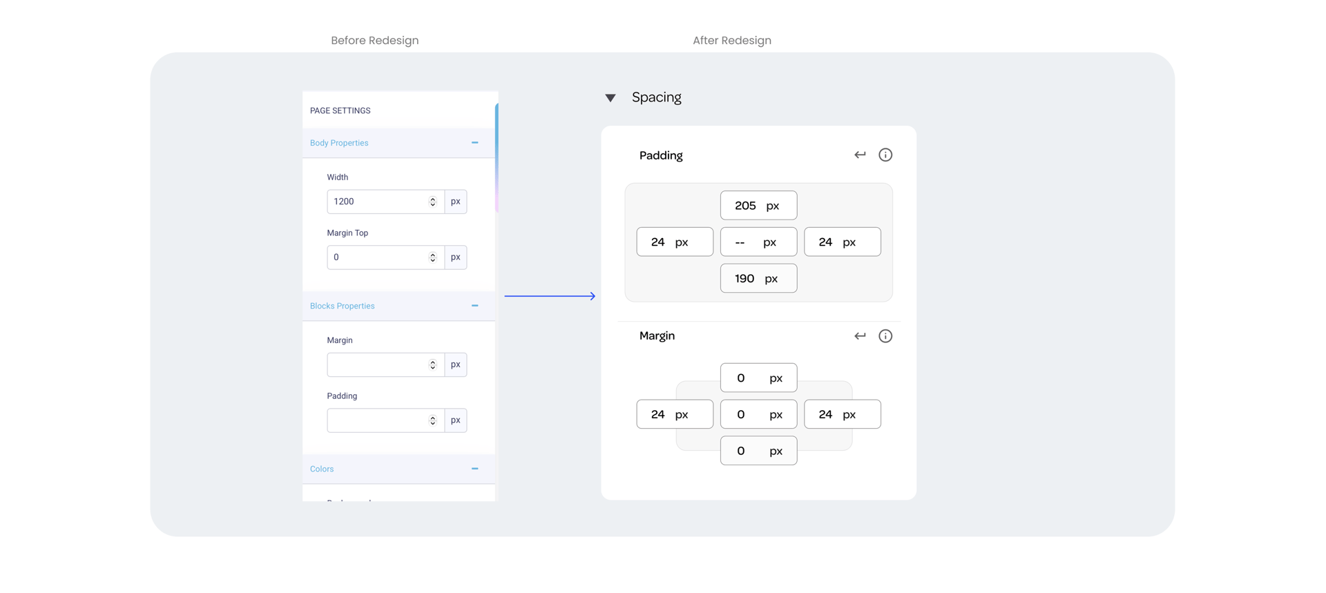
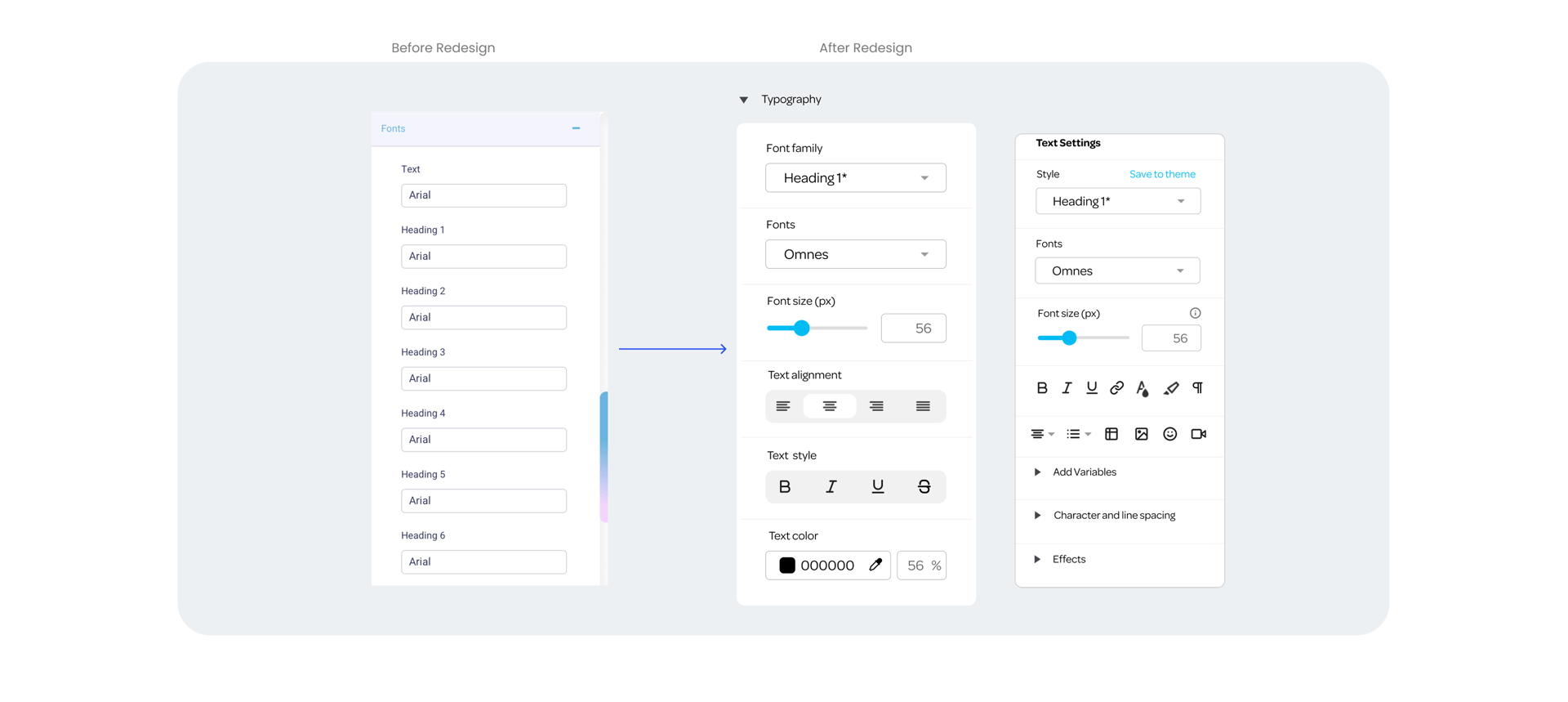
Before redesign...
Elements were taking up unnecessary space.
Navigation and element placement were difficult to locate.
The CTA was not appropriate, and the "Save as Template" option was missing.
Spacing was not appropriate; there was too much blank space on the page.
The live preview was missing, and the editing section lacked a clear sequence.
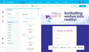
After redesign :)
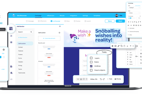
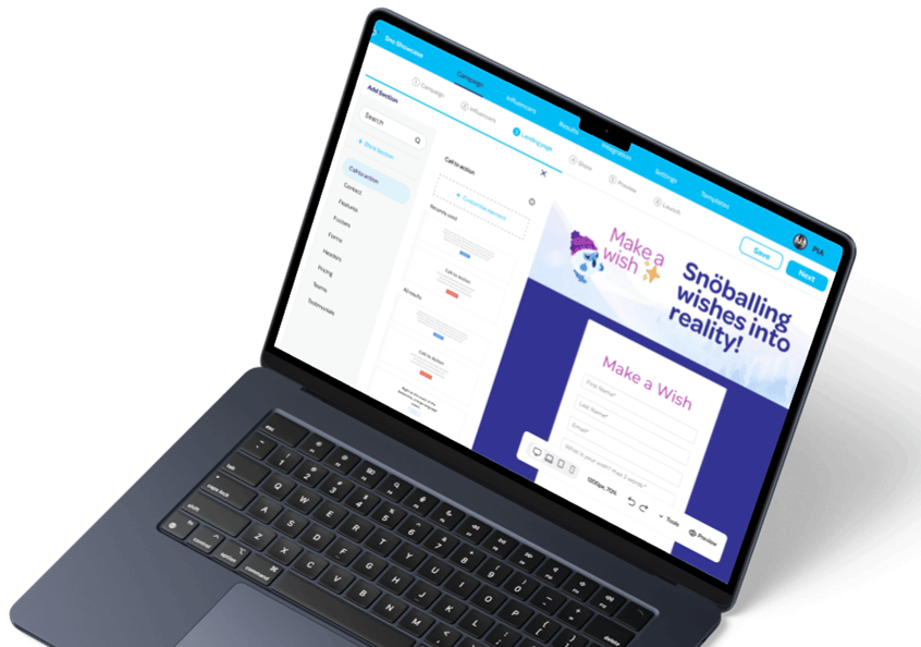
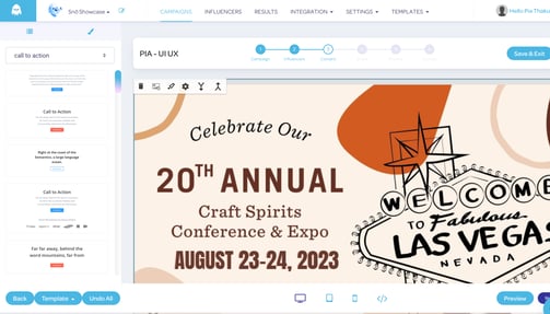
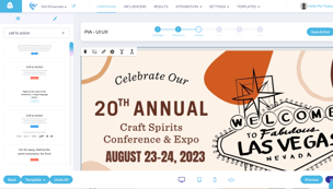
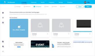
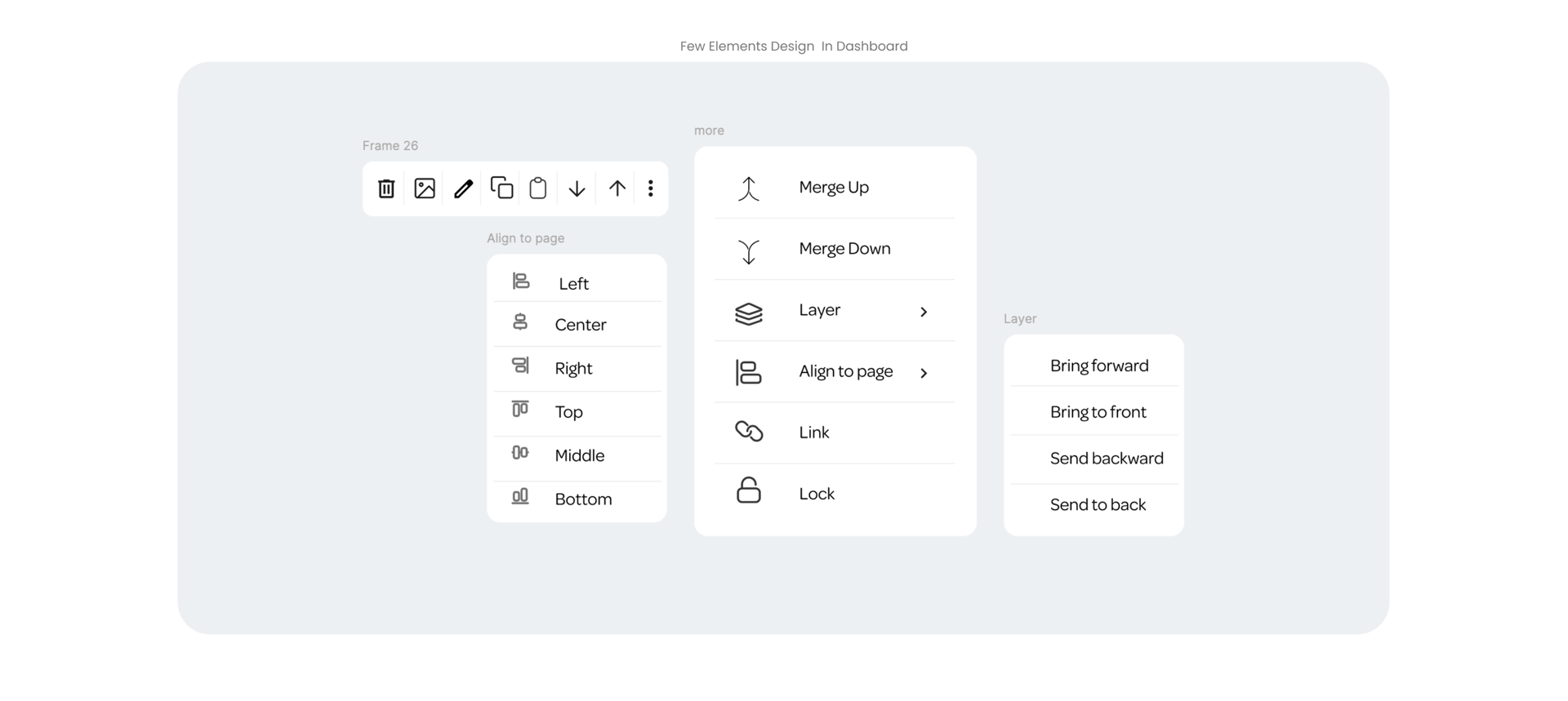
Landing Page Editor
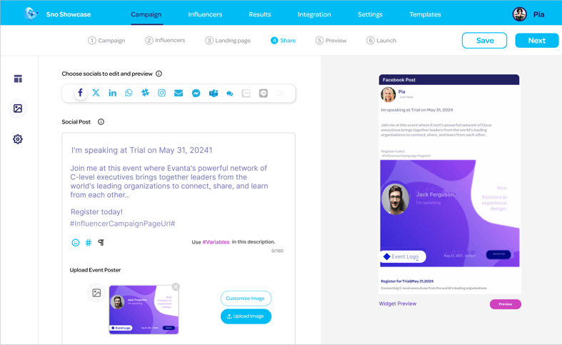
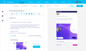
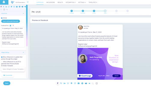
Share Page Editor


Scroll to see the before & after. I focused on small UI elements that seem tiny—but make a big difference in how smoothly users design their campaigns.

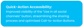
To overcome the issue of users starting campaigns from scratch, I introduced a template-saving feature—making the process faster and less mentally tiring by allowing design reuse and easy customization.
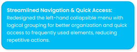
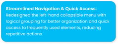
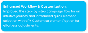
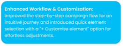
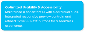
The redesigned Snöball dashboard improves navigation with clearly separated sections, making it easier to manage campaigns. Key actions are now more accessible, reducing task completion time. Template selection, a streamlined sharing flow, and performance enhancements create a smoother user experience.
PROTOTYPE
Research
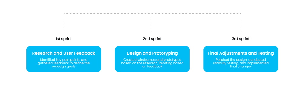
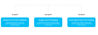
Due to the project's limited timeframe, I adopted an Agile methodology to redesign the dashboard, dividing the work into three-week sprints. This approach allowed for iterative progress and timely adjustments.
Each sprint had specific objectives:
3-Week Agile Sprint
USER INTERVIEW
To learn more about the Dashboard experience and identify user needs and pain points. I conducted 3 interviews with campaign managers.
What does their typical day look like when using the dashboard?
What challenges do they usually face while creating campaigns?
Which parts of the dashboard do they feel could be improved?
How long have they been working with the dashboard?
Focusing on:
USABILITY TESTING
I observed participants performing common tasks such as:

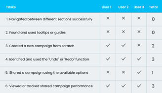
Challenges Identified:
Users hesitated when transitioning between steps, such as moving from the landing page editor to the share page editor.
Users had difficulty locating features like customizing content, colour guide and preview
Some long-time users are used to these poorly designed features because they work with them daily, but they need improvement for better usability.
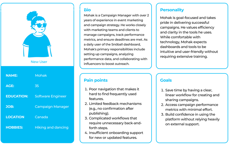
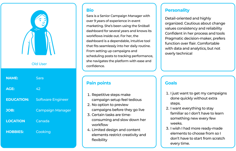
USER PERSONA
Empathy Mapping
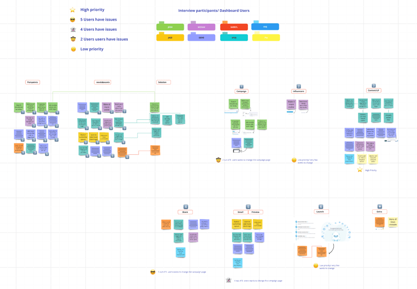
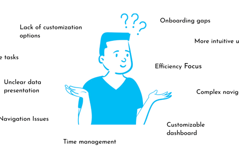
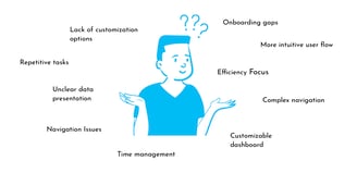
After conducting user interviews and usability testing, I created an Empathy map to organize and identify recurring pain points and user needs. This process highlighted common challenges users face and areas for improvement.
The majority of users highlighted the need to redesign the landing page and sharing page, emphasizing improved usability and a more intuitive layout to enhance their experience.
*Empathy mapping board created using the Miro platform.


Repetitive tasks
Navigation Issues
Onboarding gaps
Efficiency Focus
Lack of customization options
Unclear data presentation
Complex navigation
More intuitive user flow
Customizable dashboard
Time management
KEY INSIGHTS FROM RESEARCH
Expect easy Learning


I conducted user testing to make sure the new updates matched what users needed and stayed aligned with the brand. I created a click-through prototype in Figma to test how users would interact with the redesigned dashboard.
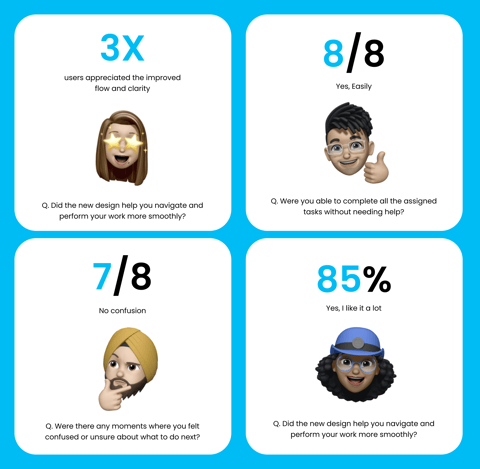
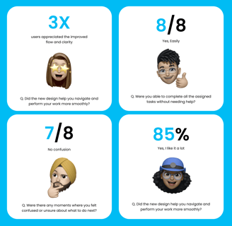
In the third sprint, I did 8 tests with Campaign Managers. The reactions were great, and I also noticed a few areas that needed some adjustments. I took that feedback and improved the design.
It was really nice to see their work is 3X faster than before.
USER TESTING
📢 Marketing Contribution
Beyond my role in product design, I also supported Snöball’s marketing team by contributing to campaign visuals and social media content, like:
Designed linkedIn content creation that showcased features, benefits, and campaign highlights


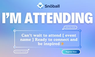
Designed share cards for attendees, speakers, and sponsors to promote events


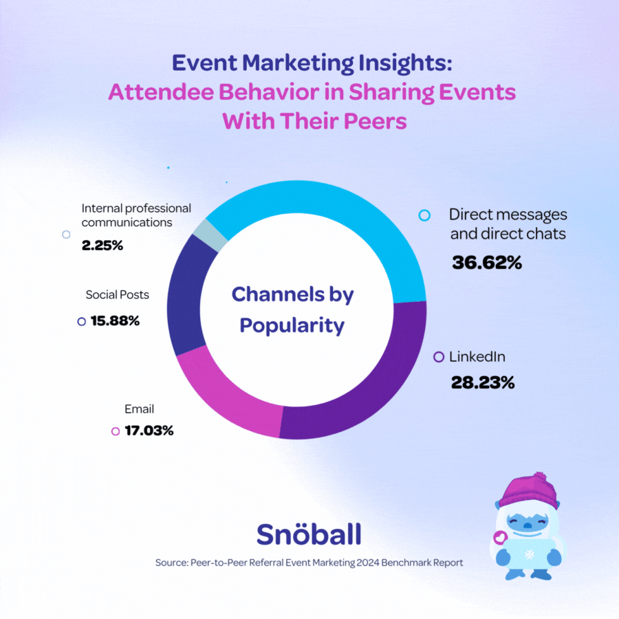
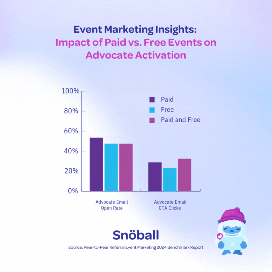
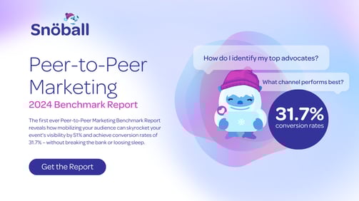
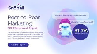
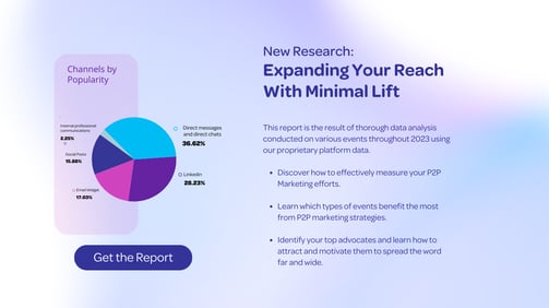
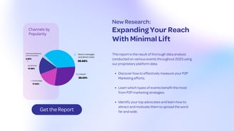
Designed a Benchmark Report highlighting industry trends, key metrics, and Snöball’s value


"Pia did an amazing job creating share templates that really worked for different audiences like attendees, partners, and speakers. She also led a full UX research study, from surveys to interviews, and built empathy maps that helped us understand key user patterns. Using those insights, she redesigned key parts of the platform like the social share editor and landing page editor, which improved usability and made the experience smoother overall."
Mohak Grover ( Campaign Manger)

★★★★★
Lets Connect!


Lets Connect!
