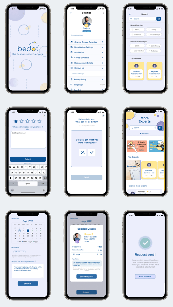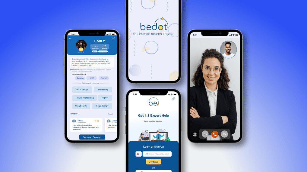
The Bedot dashboard aims to simplify mentor discovery, session booking, and real-time interactions while ensuring a secure, user-friendly experience. It prioritizes trust, transparency, and seamless navigation to enhance learning and informed decision-making.
6-7 Weeks
UX Research,
Wireframe, Prototype
Final App Design
Testing
Figma
Miro
wireframecc
Slack, AdobeXD
MY ROLE
TIMELINE
TOOLS
OVERVIEW
Bedot addresses the lack of a reliable platform connecting users with verified domain experts.
key Focus Areas:
Provides credible and trustworthy advice from mentors.
Covers fields like education, career, health, and relationships.
Problem Statement
Goal
To create a safe, transparent, and credible app that provides users with trusted expert advice and guidance in a seamless and user-friendly way.


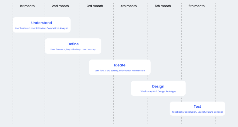
DESIGN TIMELINE
USER RESEARCH
Users prefer a simple and easy-to-use interface, emphasizing user-friendliness and easy navigation.
The demand for live one-on-one sessions highlights the value of personalized and tailored advice over pre-recorded or generalized content.
COMPETITOR ANALYSIS
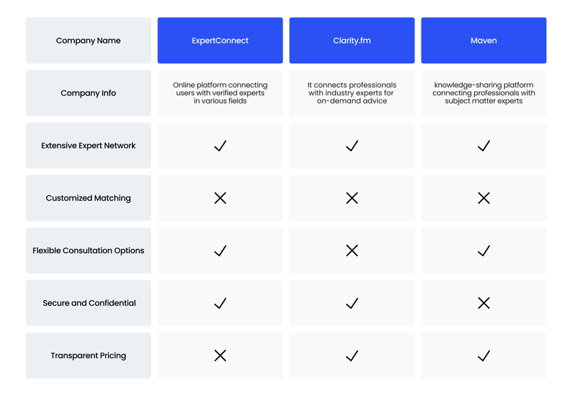
Key players include JustAnswer, Clarityfm, and Maven, offering expert advice across various fields.
Analysis of strengths and weaknesses provided insights into market trends and user expectations.
UNIQUE FEATURE
Real-Time, 1:1 Mentor Sessions: Bedot offers live, personalized interactions with verified domain experts, providing users with immediate advice and guidance tailored to their needs.
Intelligent Mentor Matching: The app ensures users are paired with the most suitable experts based on their specific queries, enhancing efficiency and satisfaction.
QUANTITATIVE RESEARCH
Quantitative research involved analysing data from surveys and user interactions to gather statistical insights. This data provided valuable information on user demographics, preferences, and usage patterns, guiding our decision-making process and validating design choices.
I conducted quantitative research across various age groups to uncover the distinct preferences of Gen Z, Millennials, and older users for Bedot. This research provided valuable insights into how different demographics interact with and perceive the app, helping to tailor the user experience to their unique needs.
Gen Z values affordable, quick access to advice and prefers sleek, modern, and visually appealing designs.
Millennials prioritize credible experts for major life decisions and value flexible, convenient session booking.
Older users value trust and reliability, seeking personalized advice to address specific concerns.
Gen-Z
(18-25)
Millennials
(26-45)
Old Users
(46+)
Observations:
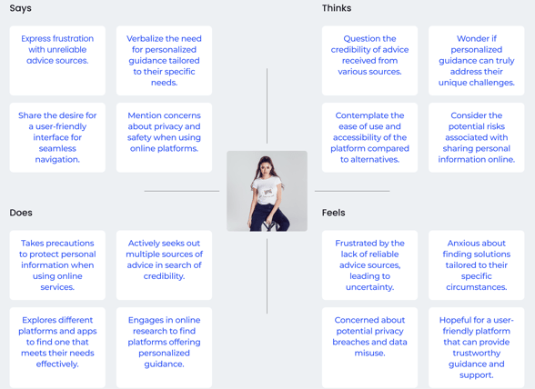
EMAPATHY MAPPING
Through empathy mapping, I concluded that users value affordability, convenience, and trust. This process clarified their key motivations and pain points, helping to design a platform that aligns with their needs and emotions.


USER PERSONA
The user personas reveal distinct pain points across age groups, highlighting the need for a platform that seamlessly combines accessibility, flexibility, and reliability. I discovered that tailoring user-centric solutions to these diverse needs can significantly enhance the overall user experience and satisfaction.


Emma Rivera
Age: 22
Role: College Student
Pain-Points
Limited budget restricts access to expert advice.
Needs quick, hassle-free solutions.
David Chen
Linda Patel
Age: 35
Role: Marketing Manager
Pain-Points
Struggles to find credible and experienced experts.
Prefers flexible session scheduling options.
Age: 53
Role: Business Owner
Pain-Points
Distrust from past unreliable advice experiences.
Requires tailored solutions for unique concerns.
🤔
😊
😌
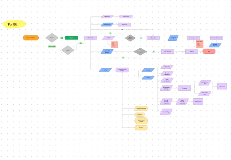
USER FLOW
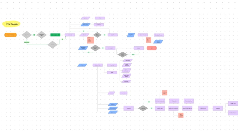
The user flow is divided into two Users: Mentors and Mentee..
The Mentor user flow focuses on streamlined onboarding and session management for experts, while the Mentee User flow emphasizes effortless discovery, booking, and interaction with the right expert. Both flows are designed for simplicity and efficiency to ensure a seamless experience.


STYLE GUIDE
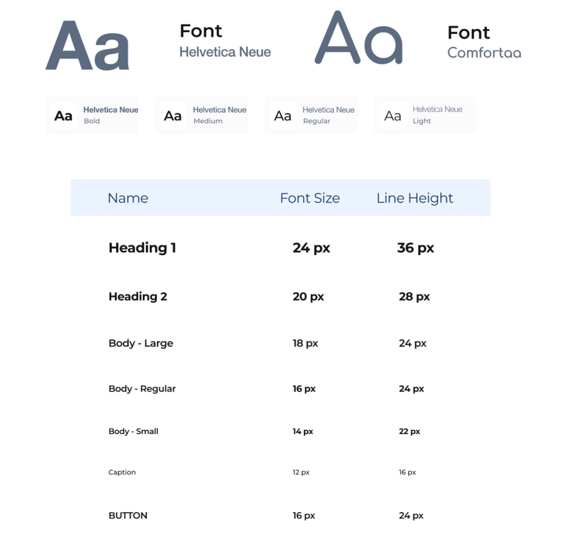
I created multiple design options and presented them as mood boards to the stakeholders. After receiving feedback, I narrowed down the design direction and created detailed design mockups that showcased the app's layout, color scheme, and typography. This process allowed me to establish a comprehensive design style guide that the development team used to build the app.


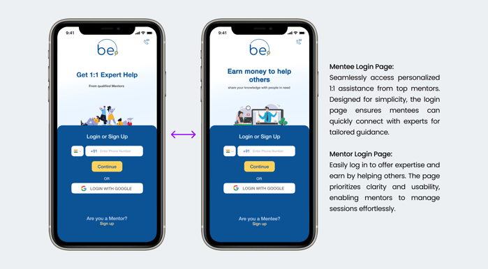
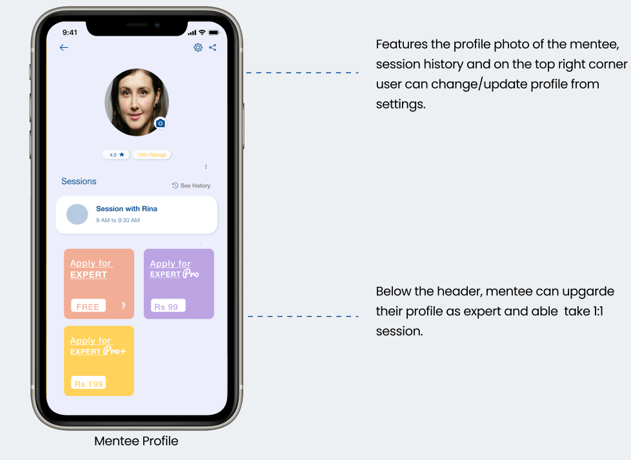


The login pages for Mentors and Mentees are tailored to their specific needs, ensuring clear navigation and ease of access. Designed with simplicity and functionality, the pages provide a seamless entry point to their respective user flows.
FINAL UI SCREENS




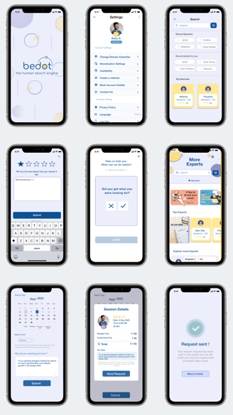
MORE UI SCREENS
