1 Weeks
Design System,
Created components and design tokens
Figma
MY ROLE
TIMELINE
TOOLS


OVERVIEW
Every time I started a new project or started a new phase of the project I was creating projects from scratch. This would mean setting up a new components library each time.
This meant I was designing the same components over and over again with the style changing each time to suit functionality.
Problem
BENEFITS
It’s a single source to view components, patterns, and styles.
New changes for the same projects can be redesigned and managed at scale through the design system.
Design resources can focus less on tweaking visual appearance and more on complex problems/solutions. This ensures that the project and designs are consistent visually and functionally.
Ability to replicate designs quickly by utilising pre-made components and elements.
Reducing the need to reinvent the wheel and eliminating inconsistency.
Reduces wasted designs or development time around miscommunications.


RESEARCH
The first step I took in creating my design system was researching and analyzing the design systems of famous companies like Apple, Google, and Spotify. These brands are known for their clean, consistent, and user-friendly interfaces, and I wanted to understand the strategies behind their success. By studying their design systems, I gained insights into best practices and key principles that helped shape my approach.
Here’s how I applied the Atomic Design principles to build my system:
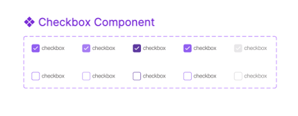
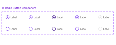
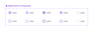
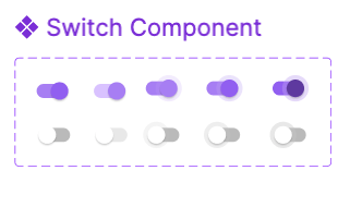
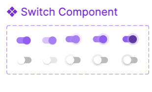
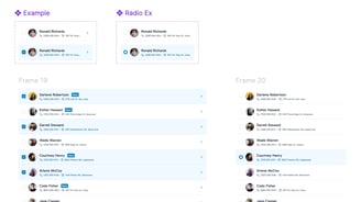
Atoms: I started with the smallest components, like buttons, input fields, and icons, which formed the foundation of my design.
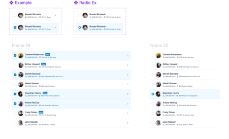
Molecules: I then combined these atoms into functional units such as search bars and form fields, creating reusable components that could serve multiple functions.
Organisms: I grouped these molecules into more complex structures like navigation bars, cards, and modals, which could be used across different sections of the interface.
Templates: I designed layouts using organisms, focusing on the structure and placement of elements without real content, ensuring flexibility for various page types.
Pages: Finally, I populated these templates with real content to test the design’s functionality and user experience.


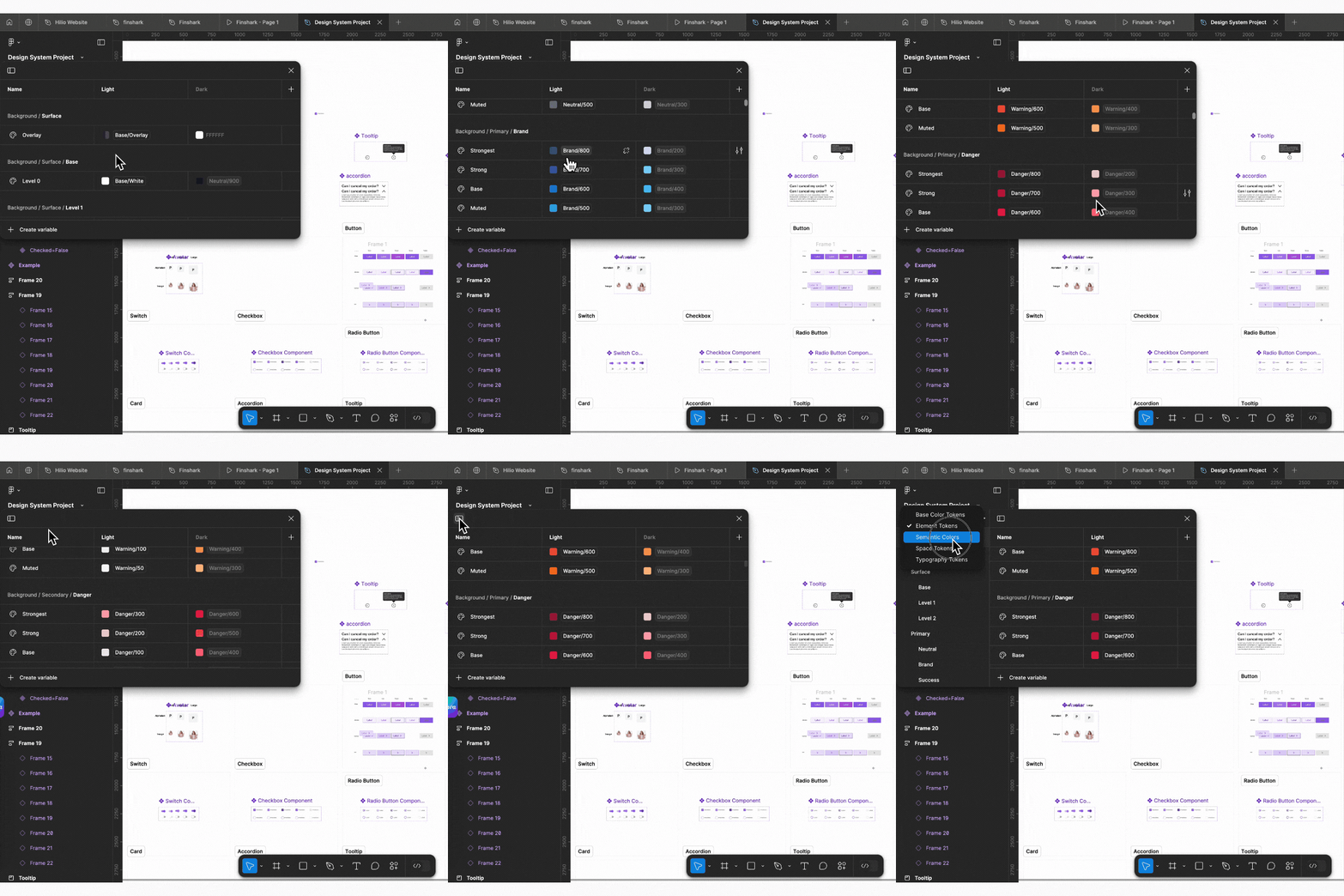


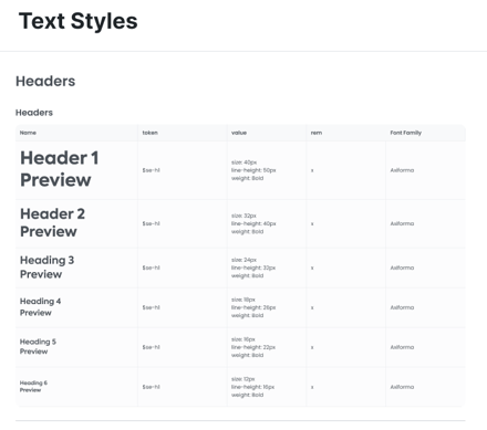
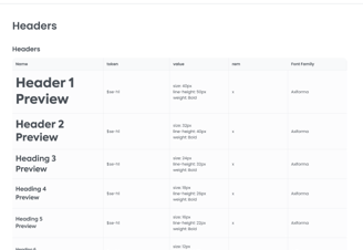
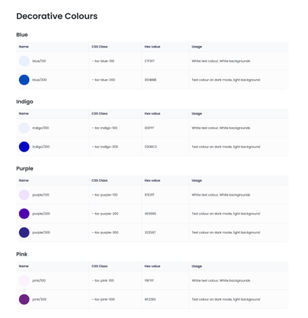
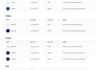
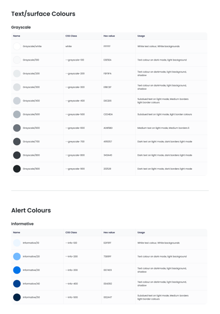
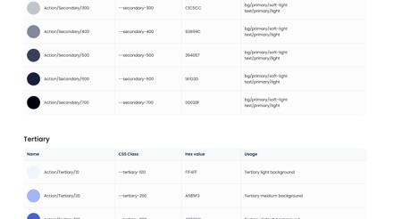
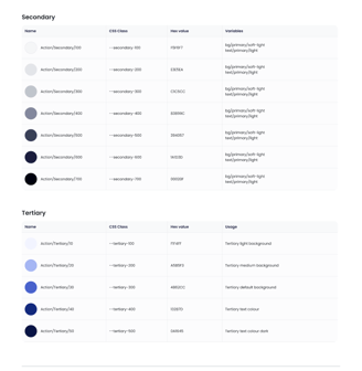
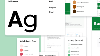
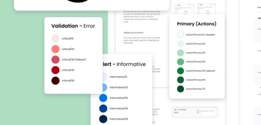
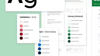
Branding (colours, typography (Web & Mobile, Logos)
Spacing guidelines
Layout grids
Icon pack
Border radius guidelines
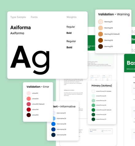
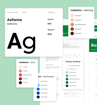
THE STYLE GUIDE INCLUDES
