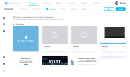
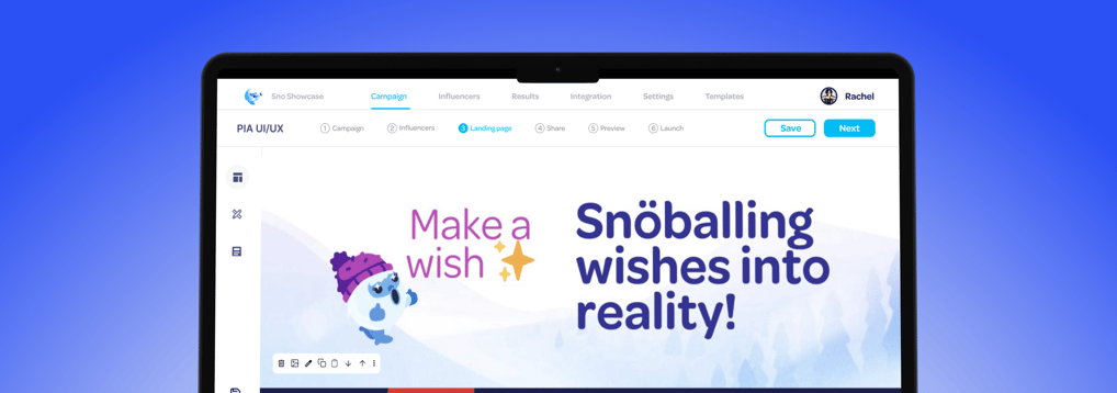
Snöball est une plateforme qui permet aux organisateurs d'événements de transformer les participants, les intervenants, les sponsors et les partenaires en porte-parole qui font la promotion des événements. Le tableau de bord de la plateforme est un outil essentiel pour les Customer Success Managers (CSM) pour créer et gérer des publications sur les réseaux sociaux, des pages de destination et des campagnes d'influence.
2-3 Weeks
UX Research,
UI Dashboard design
Usability Testing
Prototype
Figma
Miro
Fathom
Slack, AdobeXD
MY ROLE
TIMELINE
TOOLS


OVERVIEW
The existing dashboard for Customer Success Managers (CSMs) lacks intuitive navigation, clear workflows, and sufficient customization options. These challenges hinder efficiency, create frustration, and limit the dashboard’s ability to support users in managing social posts, landing pages, and campaigns effectively.
Problem
Goal
Redesign the dashboard to streamline navigation, clarify workflows, and introduce customizable features, ensuring a more user-friendly and efficient tool that meets the needs of CSMs and enhances their overall experience.
RESEARCH
DESIGN PROCESS
Empathy Mapping
User Persona


User Research
User Interview
Usability Testing
SYNTHESIS
IDEATION
FINAL DESIGNS
REFLECTION
Developing solution
Prototype
Major Redesign
Testing
Post design


USER INTERVIEW
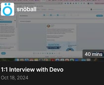
In order to learn more about the Dashboard experience and identify user needs and paint points. I conducted 3 one-on-one interviews with campaign managers and dashboard users.
What does a typical day in your workflow look like?
What challenges do you face when creating campaigns?
Which aspects of the dashboard could be improved to better meet your needs?
How many years of experience do you have working with this dashboard?
Repetitive tasks: Manual inputs take up significant time.
Navigation issues: Difficulty finding features slows users down.
Reporting needs: Users want more flexible reporting tools.
Onboarding gaps: New users struggle without better guidance.
Efficiency focus: A simpler, streamlined interface is highly desired.
Key Insights:
Focusing on:


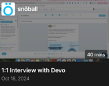
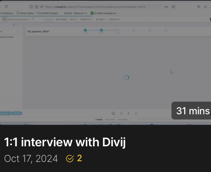
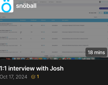
*Screenshots from user interviews conducted on the Fathom platform.
USABILITY TESTING
I observed participants performing common tasks such as:
Designing a social post
Uploading influencer lists
Sharing campaigns across multiple channels
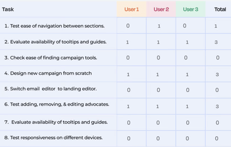
Challenges Identified:
Users hesitated when switching between steps (e.g., from content creation to previewing).
They struggled to find features like analytics or advanced sharing options.


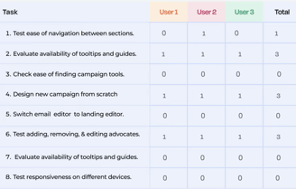
*Screenshots from usability testing conducted on the Google Meet platform.
Empathy Mapping
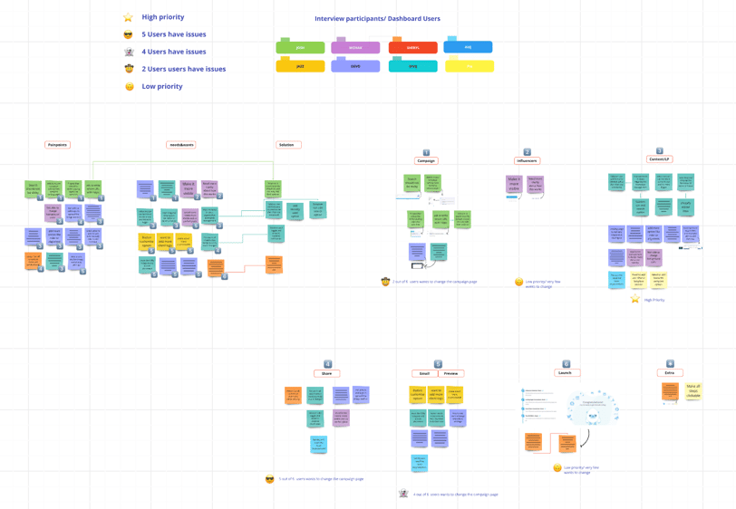
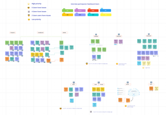
After taking user interviews and usability testing, I created an Empathy map to organize and identify recurring pain points and user needs. This process highlighted common challenges users face and areas for improvement.
The majority of users highlighted the need to redesign the landing page and sharing page, emphasizing improved usability and a more intuitive layout to enhance their experience.
*Empathy mapping board created using the Miro platform.
USER PERSONA
During the research phase, I conducted interviews with 10 users, asking questions like, “What challenges do you face in navigating the dashboard?” and “Which features do you rely on most frequently?” These interviews provided valuable insights that guided the creation of user personas, ensuring the dashboard addresses the needs of diverse users.
I discovered that a simplified and task-focused interface aligns best with user workflows. As a result, this approach became the foundation for the dashboard's redesign.


Mohak
Age: 30
Role: Camping manager
Pain-Points
Struggles with complex navigation and difficulty locating features.
Finds it time-consuming to create and manage campaigns due to manual data entry.
Emily
Tom
Age: 25
Role: Event Coordinator
Pain-Points
Overwhelmed by the cluttered interface, leading to confusion and delays.
Difficulty tracking campaign performance due to limited analytics features.
Age: 40
Role: Marketing Specialist
Pain-Points
Difficulty understanding the dashboard without adequate onboarding support.
Frustrated by repetitive tasks and lack of automation.
🤔
😌
😊
FINAL DESIGNS
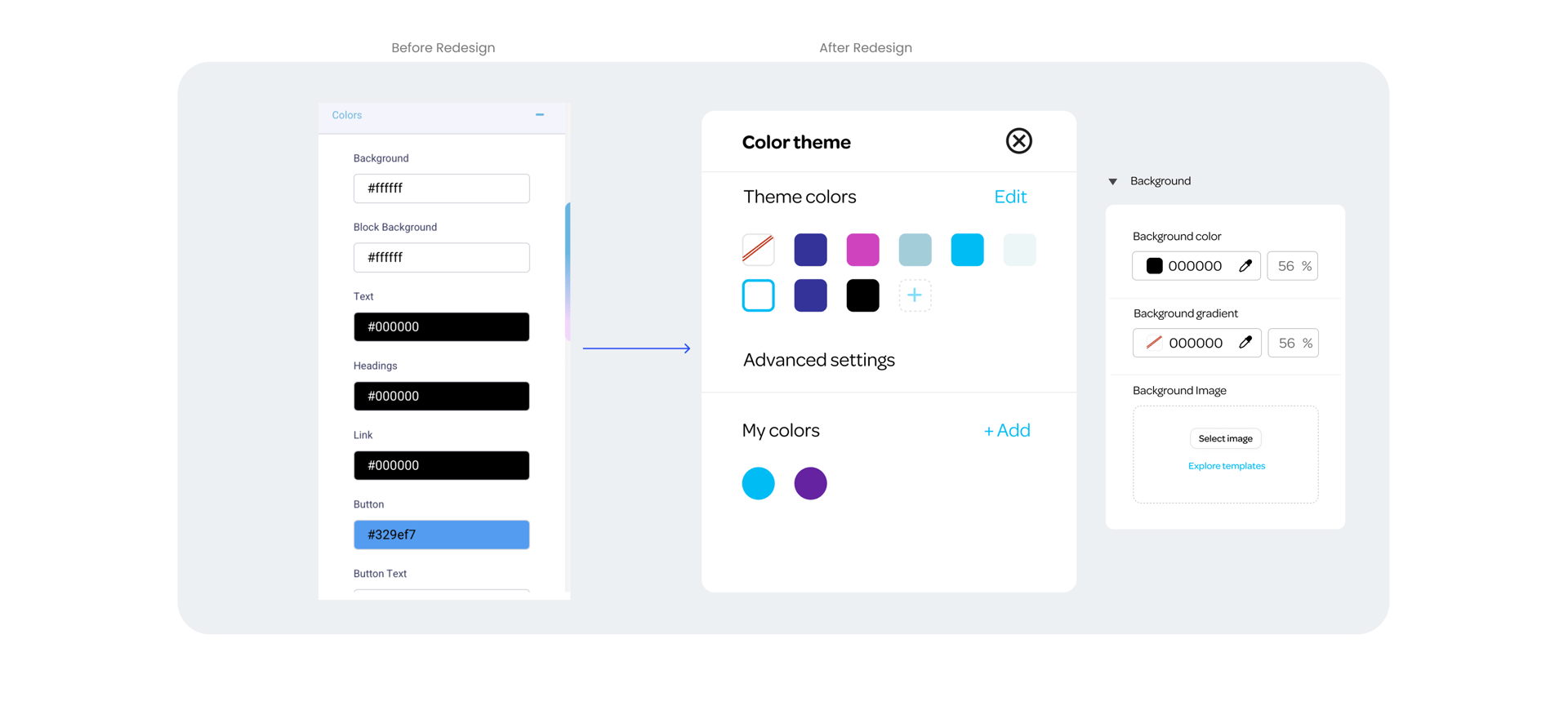
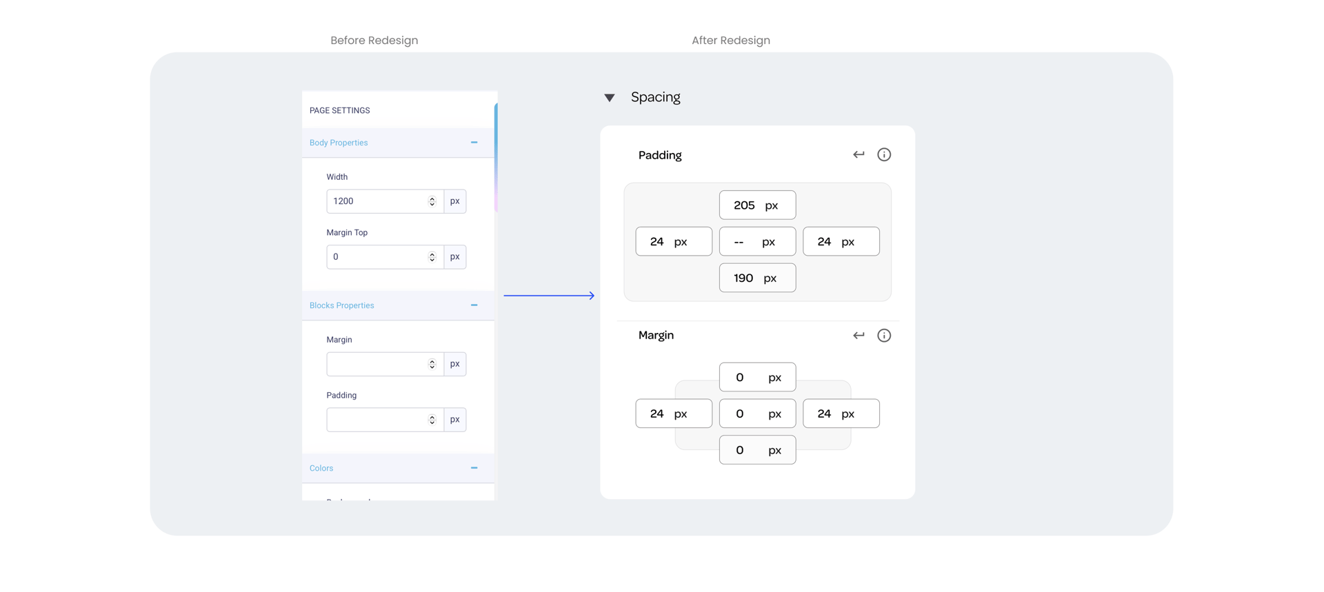
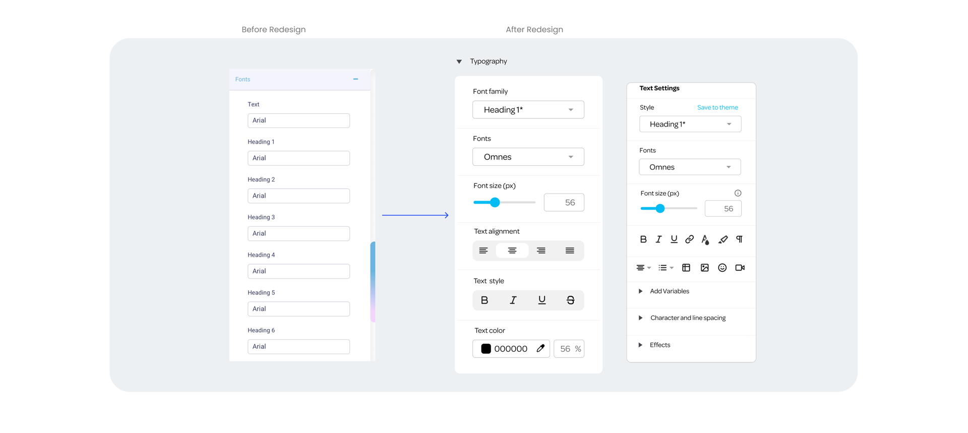
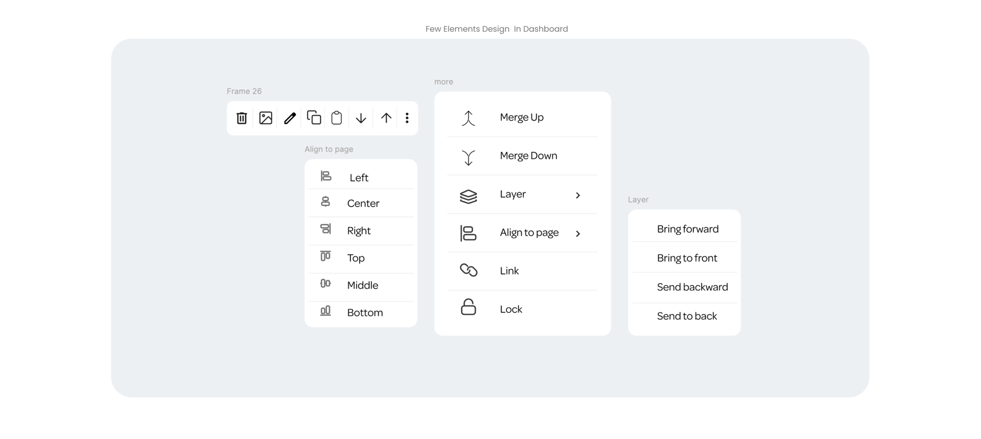
When creating a design, I focused on consistency and usability by implementing a component-based system for reusable elements like Call to Action and Forms. Clear navigation, guided workflows, and responsive preview modes were introduced to streamline the user experience and simplify task completion..


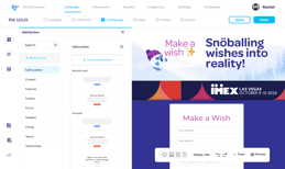
*Landing page redesign
When redesigning the social share section, I ensured a streamlined user experience by incorporating customizable fields for profile images and event logos. The design includes a live preview feature, enabling users to see real-time updates as they personalize posts for various social platforms. This approach simplifies content creation, improves consistency across channels, and enhances user control.


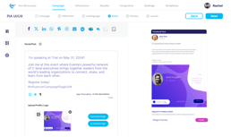
*Share page redesign
I incorporated a template-saving feature that allows users to save their customized designs for future use. This not only eliminates the need to start from scratch each time but also gives users the flexibility to fully customize their saved templates, making it easy to tweak designs, update content, and adjust layouts as needed for consistent yet fresh posts.


